
A WHALE OF A REBRAND FOR
NANTUCKET HISTORICAL ASSOCIATION

The IDEA
FARAWAY FROM
THE EXPECTED
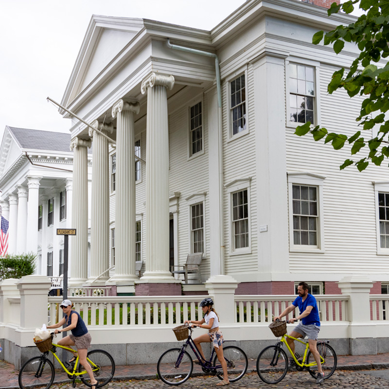
Our goal wasn't to diminish the Whaling Museum's popularity, but to use its success as a gateway to help people discover all the fascinating stories NHA tells about Nantucket's complex history, from women's rights to coastal resilience and preservation. Through its properties, programs, and events, NHA introduces people to parts of Nantucket history far more intriguing and relatable than their preconceptions (hello, red pants).
The BRAND
A BRAND
REFRESH AFTER
130 YEARS
The comprehensive brand refresh transforms the 130-year-old NHA’s visual identity to better reflect its extensive offerings of historic sites, island tours and year-round community programs to include the Whaling Museum as part of a cohesive brand ecosystem.
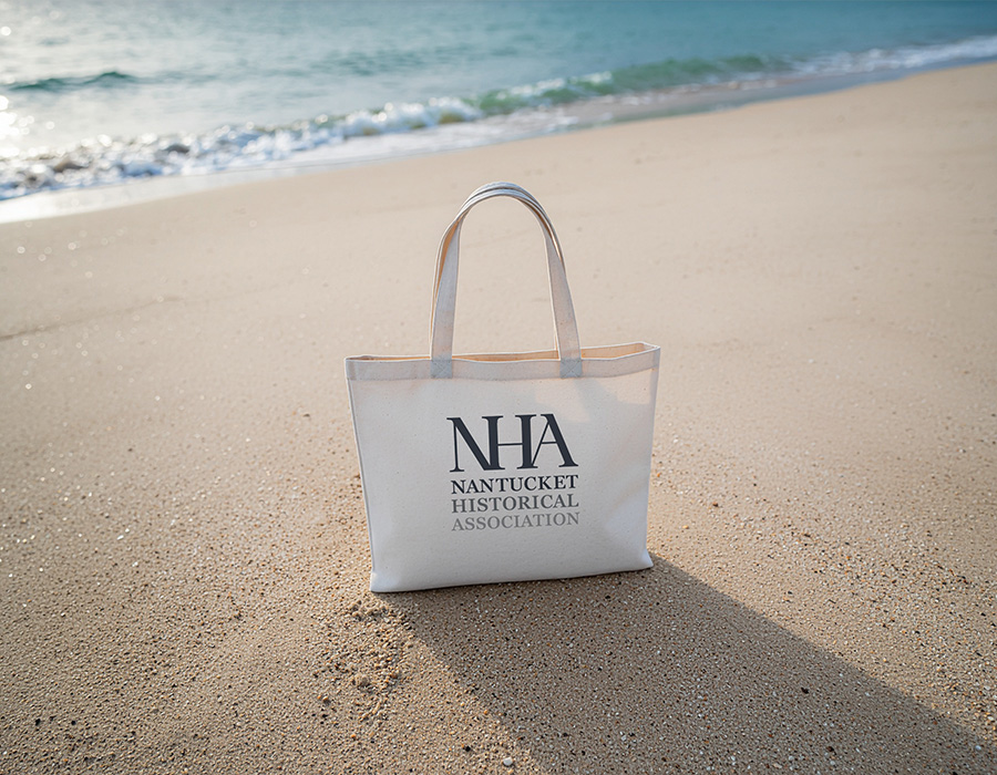
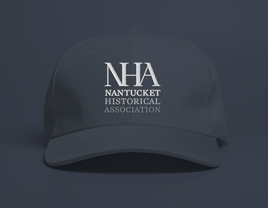
The new brand identity centers on a custom typeface drawn directly from artifacts in NHA's own collections, creating an authentic connection to the organization's historical roots while feeling fresh and accessible to modern audiences. The redesigned NHA logo features three interconnected letters that symbolize the unbreakable connection between Nantucket's past, present and future.
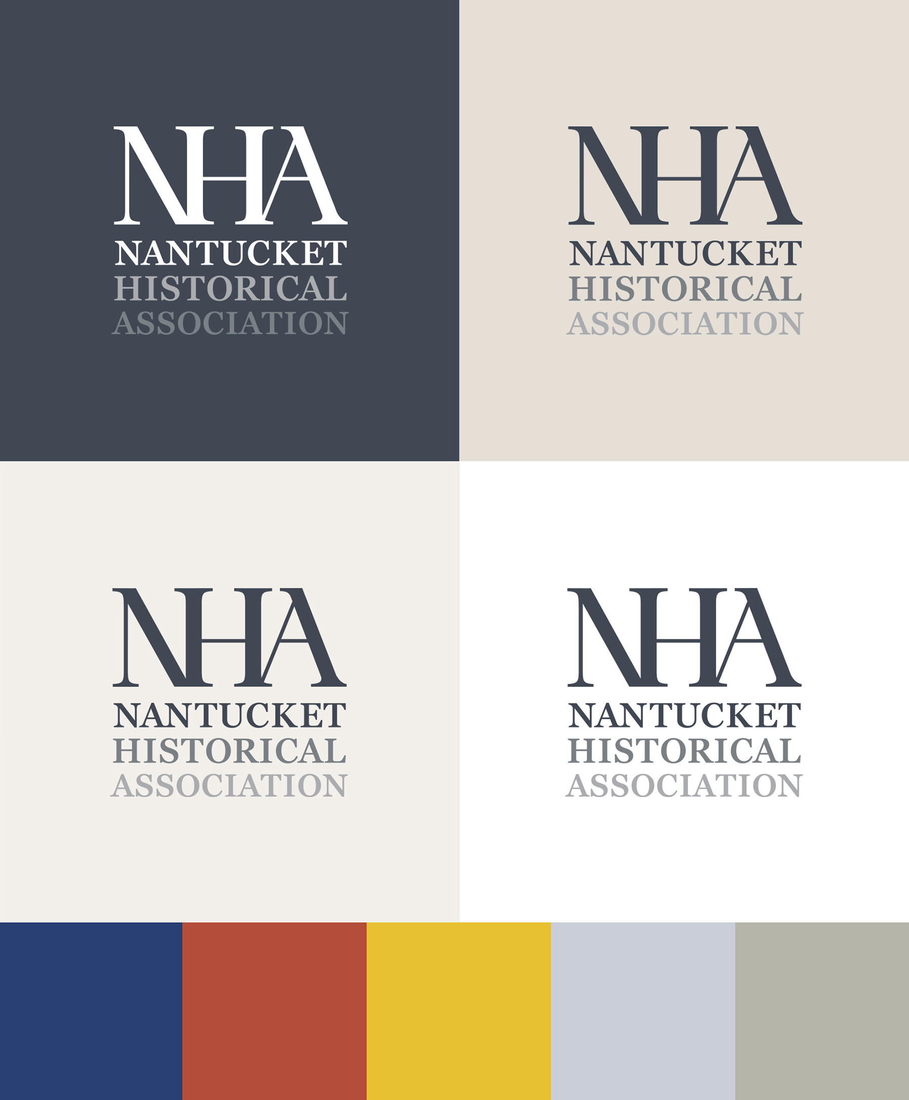
A sophisticated color palette anchors the rebrand. Grey serves as the primary brand color — a tribute to Nantucket's nickname “The Grey Lady” — while supporting colors are inspired by the island's distinctive red brick buildings, weathered cobblestone streets, and surrounding Atlantic Ocean.
Niles D. Parker
NHA Gosnell Executive Director
"The most interesting parts of history are found in the grey areas — the nuances, complexities and contradictions that reveal how the past connects to our present. This rebrand creates for us a unified identity system that invites people to look beyond the expected and discover stories that will illuminate and surprise.”

46 Plympton St, Floor 5
Boston, MA 02118
617-391-0194
Say hi to us:
hello@hatchtheagency.com


Women
Owned